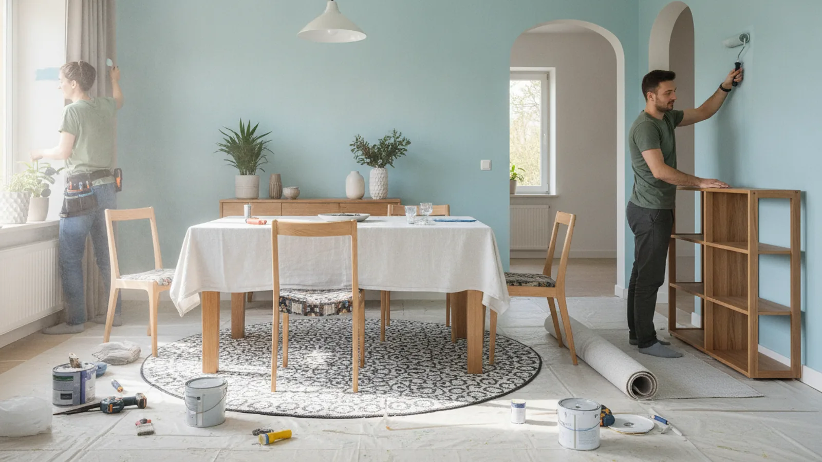
Dining Room Colour Ideas
A practical step-by-step guide to dining room colour ideas, including preparation, instructions, common issues, tips, and next steps.
Dining Room Colour Ideas
This guide explains how to approach dining room colour ideas, including the preparation, practical steps, common mistakes, and final checks that help you finish with confidence.
Before You Start
Step-by-Step Instructions
Quick Reference
Common Problems When You Plan Dining Room Colour Ideas
Colours Look Different on the Wall Than on the Swatch
This is the most frequent issue. The small size of a swatch doesn't show how light interacts with the colour over a large surface area. Your home's unique lighting – natural light from windows, artificial light from lamps (which can be warm yellow or cool white) – dramatically alters a colour's appearance. What looks like a perfect beige on a tiny card might appear pinkish or greenish on your wall.
Feeling Overwhelmed by Choices
With thousands of paint colours available, it's easy to feel paralysed by the sheer volume of options. This can lead to indecision or making a hasty choice you later regret.
Colour Doesn't Match Existing Decor
You might fall in love with a colour, only to find it clashes with your dining table, chairs, or flooring once it's on the wall. This happens when the new colour's undertones (e.g., a grey with a blue undertone) don't complement the undertones of your existing items (e.g., a warm, reddish wood floor).
The Room Feels Too Dark or Too Bright
A colour that seemed perfect can make a room feel like a cave if it's too dark for the available light, or conversely, a light colour might feel sterile or glaring if the room receives intense sunlight.
Fear of Making a Permanent Mistake
Committing to a colour can feel daunting, leading to paralysis by analysis or choosing a very safe (and sometimes bland) option to avoid regret.
Advanced Tips for Dining Room Colour Ideas
Utilise Colour Blocking or Two-Tone Walls
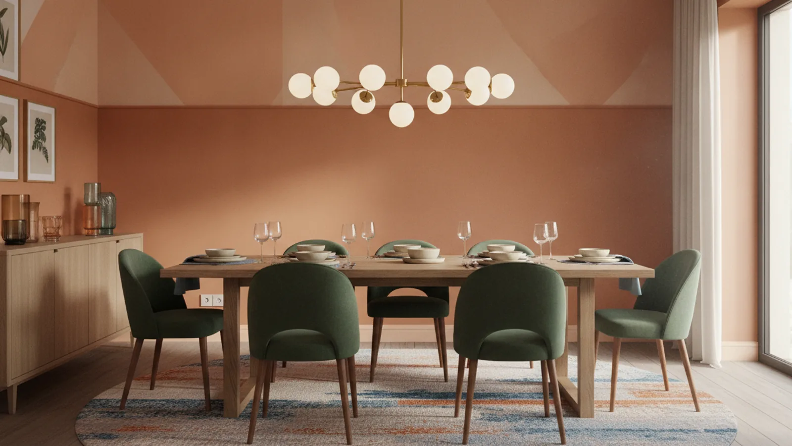
Instead of a single colour on all walls, consider painting the lower portion of the wall one colour and the upper portion another, separated by a dado rail or simply a straight line. This technique can add architectural interest, make ceilings appear higher or lower, and introduce depth. For example, a darker shade on the bottom provides grounding, while a lighter shade above keeps the room feeling open. Alternatively, you could paint one section of a wall a contrasting colour to create a modern graphic effect.
Incorporate Texture with Wallpaper or Textured Paint
Colour isn't just about hue; it's also about how light plays off a surface. Textured wallpaper (think grasscloth, linen-look, or subtle geometric patterns) or even textured paints can add visual warmth, depth, and sophistication without introducing a completely new colour. A richly textured wall can make a neutral room feel far more interesting and luxurious. Consider using texture on a feature wall to draw the eye without overwhelming the space.
Experiment with the "Fifth Wall" – The Ceiling
Traditionally, ceilings are painted white, but painting your dining room ceiling a colour can have a dramatic effect. A dark, rich colour on the ceiling can create an intimate, cocoon-like atmosphere, perfect for formal dining. A lighter, complementary shade to the walls can make the room feel more expansive and thoughtfully designed. You could even paint it a very pale version of your wall colour for a subtle, unified look. This is often called the "fifth wall" because its impact is often underestimated.
Mirror Placement for Light and Colour Amplification
Strategically placing large mirrors in your dining room can amplify both natural and artificial light, making your chosen wall colour appear brighter and the room feel larger. A mirror placed opposite a window will reflect outdoor light and views, effectively bringing more of the outside in. If you have a beautiful feature wall, placing a mirror opposite it will double its visual impact, enhancing the depth and colour of the space.
Use a Cohesive Colour Flow Between Rooms
If your dining room opens directly into another living space, think about how the colours flow between them. You don't necessarily need to use the same colour, but choose colours that share similar undertones or are part of a harmonious palette. This creates a sense of continuity and makes your home feel more cohesive and intentionally designed, rather than a collection of separate, disconnected rooms.
Consider Bespoke Colour Matching
If you have a favourite piece of fabric, an artwork, or even a specific dish that you want to match your walls to, many paint suppliers offer colour matching services. This allows you to create a truly unique and personal dining room that perfectly aligns with your cherished items. Bring in a sample of the item, and they can often create a custom paint colour for you.
Dining Room Colour Ideas FAQ
What are the best colours for a small dining room?
For a small dining room, light and cool colours are often best. Pale blues, soft greens, crisp whites, and light greys help to reflect light, making the room feel more open, airy, and spacious. Using a monochromatic scheme (different shades of the same colour) can also create a seamless look that expands the perception of space.
Can I use dark colours in a dining room?
Yes, absolutely! Dark colours like deep navy, forest green, charcoal grey, or even black can create a very dramatic, sophisticated, and intimate dining experience. They work particularly well in rooms with good natural light or when paired with effective artificial lighting to prevent the space from feeling too heavy. Dark colours can also make a large room feel cosier and more enveloping.
How do I choose a dining room colour that matches my furniture?
Start by identifying the undertones of your furniture (e.g., warm wood has red/orange undertones, cool metals have blue/grey undertones). Then, choose a paint colour that either harmonises with those undertones (e.g., warm beige with warm wood) or provides a pleasing contrast (e.g., cool grey with warm wood). Always test paint samples directly on your wall with your furniture in place to see how they interact.
Should the dining room colour be different from the living room?
It depends on your home's layout. If your dining room is a separate, enclosed space, you have more freedom to choose a distinct colour. If it's an open-plan area connected to the living room, it's generally best to choose colours that complement each other. They don't have to be the same, but they should share similar tones or be part of a cohesive palette to ensure a smooth visual flow throughout the connected spaces.
What is a good neutral colour for a dining room?
Good neutral colours for a dining room include warm greys (greige), soft off-whites (with yellow or pink undertones), creamy beiges, and subtle taupes. These colours provide a versatile backdrop that allows your furniture, artwork, and tableware to stand out, and they create a calm, sophisticated atmosphere. They are also easy to live with and timeless.
How does lighting affect dining room colour choices?
Lighting is one of the most critical factors. Natural light from different directions (north, south, east, west) casts different hues. Artificial lighting (incandescent, LED, fluorescent) also has its own colour temperature. A colour will look different in bright morning light versus soft evening light, or under warm yellow bulbs versus cool white LEDs. This is why testing samples on your wall at various times of day and under different lights is essential.
Final Checklist for Dining Room Colour Ideas
- Have you assessed your dining room's natural light and existing furniture/decor?
- Have you considered the desired mood or atmosphere for your dining room?
- Have you explored various colour schemes for inspiration?
- Have you obtained 2-3 tester pots or large swatches of your preferred colours?
- Have you painted large samples on different walls in your dining room?
- Have you observed the samples at various times of day and under artificial light for at least 24-48 hours?
- Have you considered how the ceiling and trim colours will complement the walls?
- Have you thought about how accent colours from accessories will fit into the overall scheme?
- Are you confident in your final colour choice, considering all observations?
- Have you purchased enough paint with the correct finish for your project?